
Shades of Theory is an umbrella term I have been using for a long time. Theory is often seen as elite and cerebral, which perhaps explains the general distaste around it. But I believe theory exists across a spectrum of shades — from a diagram to a text — each carrying different roles. Through this series, I want to gather fragments that may not intuitively feel like theory at first. As this collection progresses, the meaning of theory might slowly shift into something more palpable and accessible.
There are two notions I completely subscribe to. First: “theory is an organizing tool” (link) (Malcolm Gladwell). Second: “There is nothing so practical as a good theory” (Kurt Lewin). These two ideas anchor my premise of what theory can be. Through this sub-series on the blog, I will collect and share multiple fragments to extend and test this proposition. These fragments may fall within a field formed by two perpendicular axes: dense–light, text–non-text.
Here is the second in the series.
Here is the link to the first post.
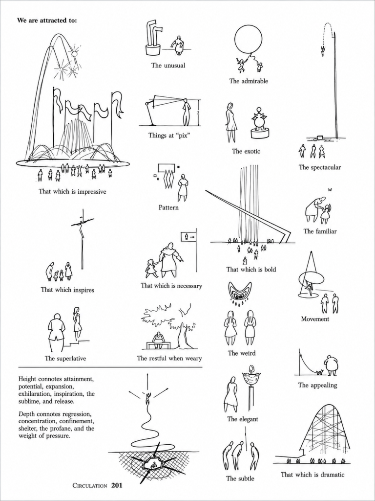
This page and drawing is from “Landscape Architecture: A Manual of Site Planning and Design” by John Simonds . First published in 1961. This is from the second edition published in 1983. It has more editions now.
My note on this drawing :
Here is my simple argument that a drawing could also be a ‘shade’ of theory.
I had come across this drawing serendipitously in a book on landscape architecture. The book has some excellent drawings that I keep referring to. On a chance rereading, I stayed with this particular image. Even though it sits in a different design context in the book, I am going to close-read this example in another context: taste and its recognition.
I have always believed that, as academics, our expectation from studios and students is always something ‘interesting’, ‘novel’ or ‘new’. A simple box is ‘too simple’. True, if it is done without rigour or care. But what if it was done with a lot of care? I feel we don’t notice the fragility of the ideas and quickly ask the student to dig deeper or move towards a better option which looks ‘new’. Even though we are not clear-cut about our inclination towards ‘new’ or ‘interesting’, this is the unsaid underlying state in any discussion in a design studio (and in other places too). I have always had this question about how to defend the ‘simple’. First, one has to pronounce that ‘it is simple’ and then have a set of references to indicate it. This leads to taste. What type of architecture does one want to pursue? This image gives a spectrum of possibilities to shape that abstract feeling, I think. From ‘subtle’ — which is just a single line, ‘familiar’ — a delightful butterfly noticed by the mother and daughter, ‘necessary’ — a clear toilet graphic, ‘pattern’ — something recognizable, ‘dramatic’ — which needs drama. This spectrum of diagrams and the text together can play with a lot of associations in the mind. Abstract notions can move towards a bit more clarity without diluting the mystery of intuition. Slow accumulation towards, and of, ‘taste’.
Oxford Dictionary defines taste as “the ability to discern what is of good quality”. What is this good quality? This is very subjective and, conversely, not arbitrary. This subjectivity need not be explained logically, but has to be indicated carefully. This act is very relevant, particularly in today’s time, as there is so much to choose from, so many positions to hold, so many biases to resist. It is so rare to find a person who has a similar taste in the same book, song or building.
This train of thought was particularly triggered when I was in recent reviews of my thesis students. The reviewers were clearly looking for something ‘novel’, ‘bold’ and definitely not ‘familiar’. I would do the same if I were in a review too. But I have built my pedagogy and taste around ‘familiar’ and ‘simple’ yet rich, deep and subtle. I have deeply resonated with things which are simple, but done with a lot of rigour. It could be just the ‘simple’ upma. It does not mean that complex and layered ‘biriyani’ is not of good taste. But it is a bit easier to like ‘biriyani’. An upma needs additional effort to stand out, because of its ordinary-ness. And in everyday life, there are missed opportunities like this.
I have carried many, may be not all, precedents which are ‘simple’ and this ‘taste’ into all my discussions with students, as one naturally carries one’s own personality. This sharing can leave strong traces with students if it aligns with their taste too. Those intersections are moments of resonance which make teaching meaningful for me.
I had a discussion with my student recently that his design was too ‘simple’ to stand out for a thesis project, and as a mentor, I had to make clear to him that it was fine by me, even if it did not fit within the general ‘academic’ range of taste. He had to be aware of where I come from and where he stands. And this image just fell in place to make this particular point: on recognizing and articulating what one’s taste is. I used it in a longer discussion with other students and also used it in a public lecture. I have been guiding thesis for a few years now, and I feel it is important to go through these layers of recognizing taste to have a deeper dialogue.
As I finish this post, it seems a bit jerky and incomplete. Initially, I began writing a short paragraph to support the above page. But this writing attempt allowed me to put more thoughts on paper. I have had a lot of procrastination even to reach this draft. The beauty of blogs is that they allow such fragments to exist and be shared. I hope to continue this topic in future posts too.


One thought on “Shades of Theory : Recognizing Taste”
Comments are closed.