
Understanding and modulating scale is one of the fundamental acts in design. Particularly while teaching in design studios, i am looking for tools and methods which can help modulate scale. This simple method of drawing different projects in the same scale has immense potential. I feel this tool is underused. Putting them together digitally has made it much easier. Just imagine pre-computer days, where one had to draw them to scale again or take scaled photocopies (and struggling with the copier to assign different percentages). I usually have the habit of drawing the room (say like 12′ x 18′ room) in which I am making the drawing in the same scale as the drawing I am working (say 1:100) to get better sense of space i am designing. I feel the responsibility of any conceptual idea is to modulate scale first. Chipperfield brilliantly notes in Theoretical Practice that scale and time are the biggest challenges of our profession. Here i have selected some drawings which uses this method effectively.
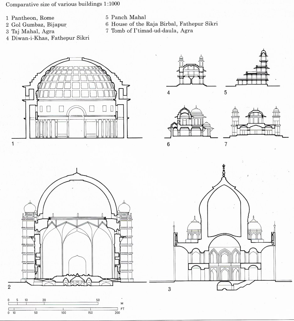
This brilliant drawing is from Henri Stielin’s book Architecture of the World: India. This drawing was a revelation – i have never been to Gol Gumbaz, but looks like Pantheon (with some diet) can fit inside Gol Gumbaz. I can sense the scale of the buiding i have not visited (Gumbaz here) through a building i have visited (Pantheon). Taj Mahal’s has an exaggerated exterior form (by the means of the double dome) compared to relatively smaller interior volume, but its presence is as monumental as the Pantheon or the Gumbaz.
Form, Space and Order : D K Ching
Prof. Kulbhushan Jain uses this method consistently in almost all his books. This drawing is from Architecture Conceptual to the Manifest. In this case when both the scale and the orientation are consistent, the reading of the project gets more sharper.
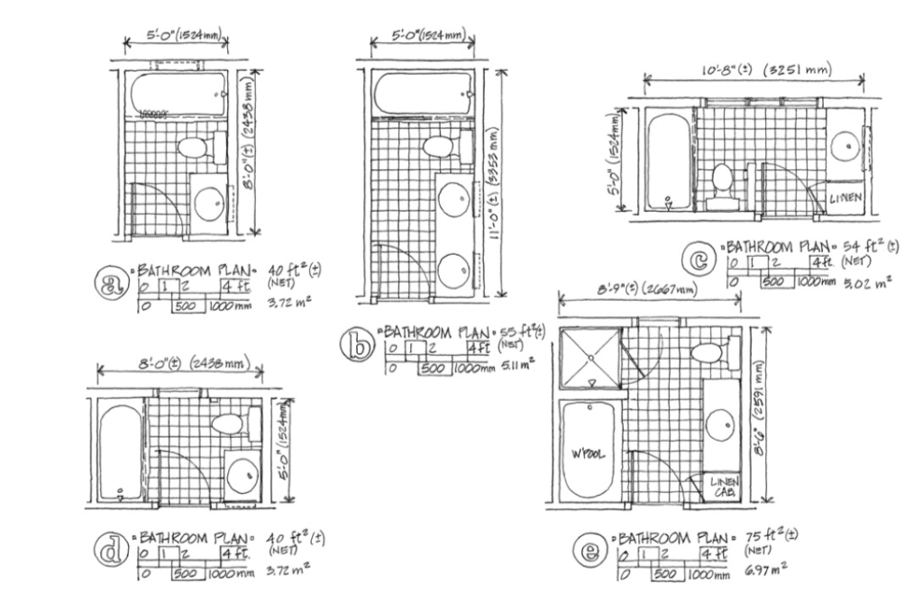
Residential Design : Maureen Mitton and Courtney Nystuen. This method is also effective at much smaller scale. When I refer this book for toilet design, I notice even a 6″ difference can make significant impact on design of such tight programs.
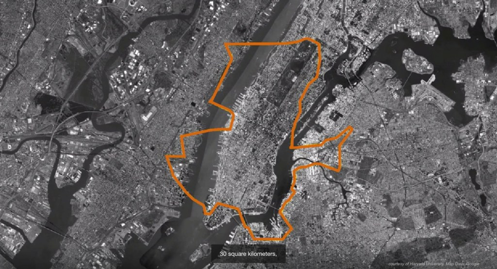
Rahul Mehrotra used this comparative diagram (In a TED Talk) by overlapping a 30 sq.km area of Kumbh Mela over the map of Manhattan to make the point of the largeness of the temporary city of Kumbh Mela.
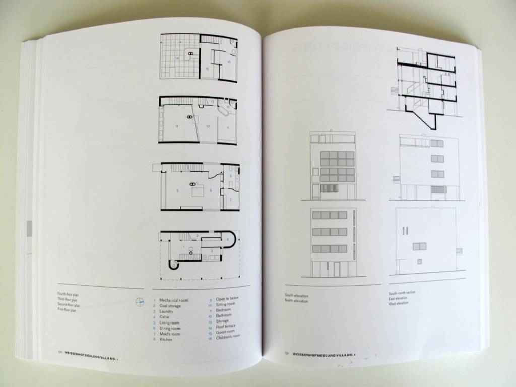

Le Corbusier Redrawn : The Houses by Steven Park. This book has drawings (plans, sections, elevations) with brilliant cut views of all the houses designed and built by Corbusier. All of them at 1:200! – and it is deep diving experience reading this book. Villa Sarabhai is one of the few project which covers both the spreads : )
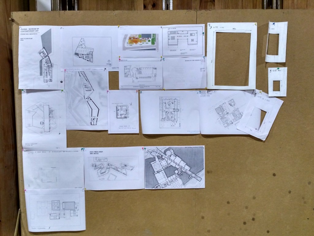
At one the of studios we tried to print all the case studies in the same scale (I think it was 1:500). It was very revealing. And we made a site plan with a hole in it at 1:500 scale to overlap against these drawings to get a sense of the scale.
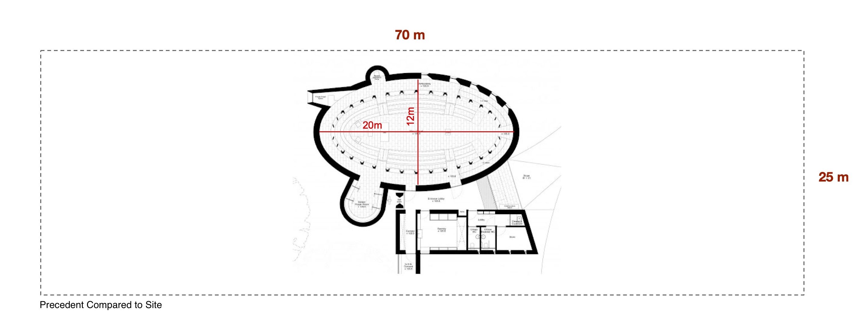
Again in one of the studios we tried to overlap the precedent we were studying (Niall McLaughlin’s Bishop Edward King Chapel) on the site at Srirangapatna. We didn’t realise the scale of the precedent till then, the project (at least the main chapel) will fit in any ubiquitous 60’x40′ site in India. There are no small projects in architecture.
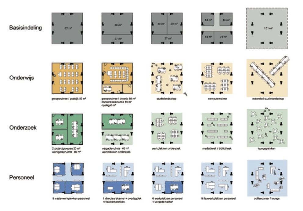
In this study for adaptive reuse of the iconic Central Beheer, Herman Hertberger’s office is trying to understand the different program possibilities and configurations for the 9m x 9m grid. It can also become an independent study of how a certain fixed area (50 sqm here) or a grid pattern (9m x 9m) can cater to different programs. We can test different possibilities to suit the site and program requirements at hand in design.
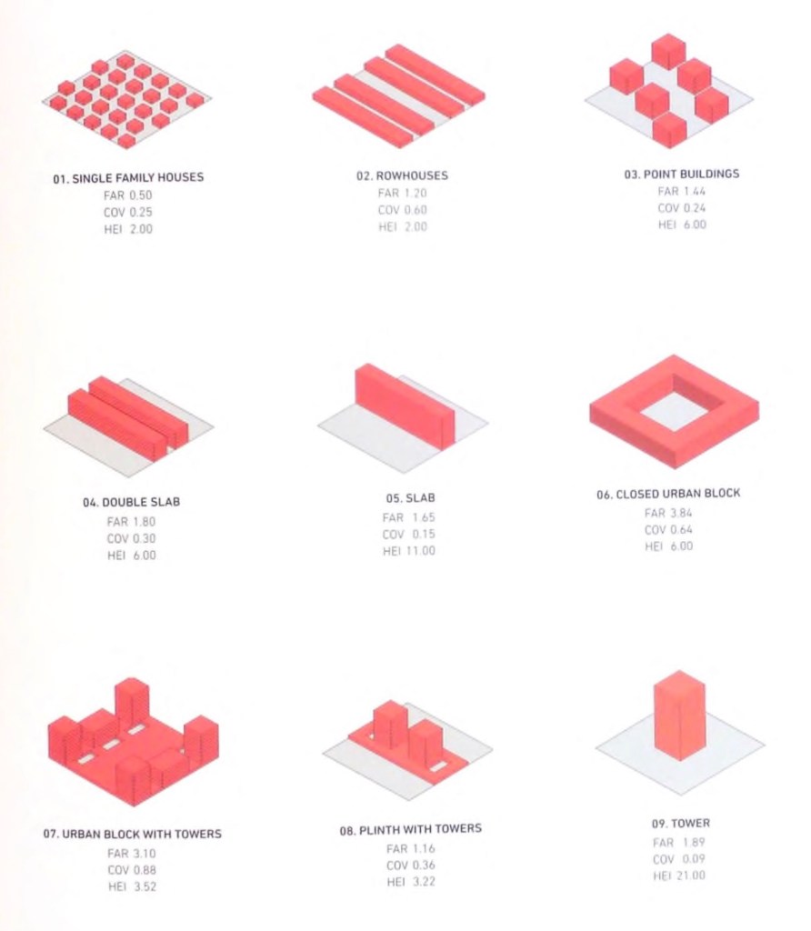
Why Density? – Debunking the Myth of the Cubic Watermelon. Here the same method is used for exploring the different massing strategies. A three dimensional comparative method.


You must be logged in to post a comment.