
Introductory Note
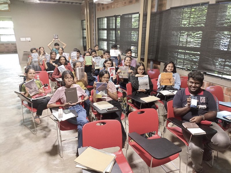
This is an invited post written by Shreyas Baindur . Shreyas and me have been teaching together for few years now. He introduced me to the amazing world of graphic novels. It was through the WCFA Book Club that we became friends. Shreyas used to bring frequently these graphic novels to the discussion and completed them at an alarming rate, when the other members like me were moving at a snail’s pace to complete the books. I had my prejudice then that these books were easy to read as they had a lot of pictures or only pictures . A shallow reading of what graphic novels meant from my side then. Then he introduced us to brilliant book – Unflattening, by Nick Sousanis – a Phd thesis in the form of a graphic novel. This book unfastened my opinion on what graphic novel means. The structure and the format is so suited to architectural thinking – this is thinking in visual from. So I invited him to put together a list of ten books as a starting point for those interested in this genre. Shreyas is well known between students for his sharp observations and the quiet sarcasm in design discussions. You will recognise a similar tint in this text too. Here is a pic of his envious collection of bookshelf (one of them) dedicated only to graphic novels.

(Click on the image for a larger view)
By Guest Writer – Shreyas Baindur
(His blog : thinkingtheinbetween.wordpress.com)
As a child, I hated reading. Seeing a book with words on every page brought nightmares. Though I might have exaggerated the scope of the issue, it was crippling enough. To alleviate my aversion to books, my mother introduced to me the Amar Chitra Katha series. Short, manageable and colourful, the graphic format of the books made me feel comfortable and were easy to consume. After reading quite a few of them, my mother found it difficult to find Amar Chitra Kathas that I hadn’t read. With this began my foray into reading graphic novels (though I would discover this joy once again many many years later), and subsequently reading in general.
For a long stint, I didn’t pick up a graphic novel. During this stint, reading was a bit slow. The lethargy to read sank in over many years and I once again grew averse to reading. Rather than reading, I chose to wait for the film adaptation of the same. As part of my architecture undergraduate studies, we were never encouraged to read books other than the standard boring textbook-like manuals. The college had a measly little rack of books for architecture concentrating on filling the shelves with engineering manuals and coffee table picture books. It was only when I got to CEPT, Ahmedabad to do my masters in architecture that I felt stupid for not having read for years. Students there many years junior to me were discussing topics I had no clue about making me feel inferior. I would occasionally pick up a book or two at a bookstore at an airport or a street-side vendor, books that sounded fancy or had colourful covers, something to make me look all intellectual while moving around such places. But the curiosity to read a book never set in until CEPT. I was reintroduced to graphic novels thanks to a friend and housemate in Ahmedabad. The book was Citizens of no place: an architecture graphic novel by Jimenez Lai. And that is where the list begins.
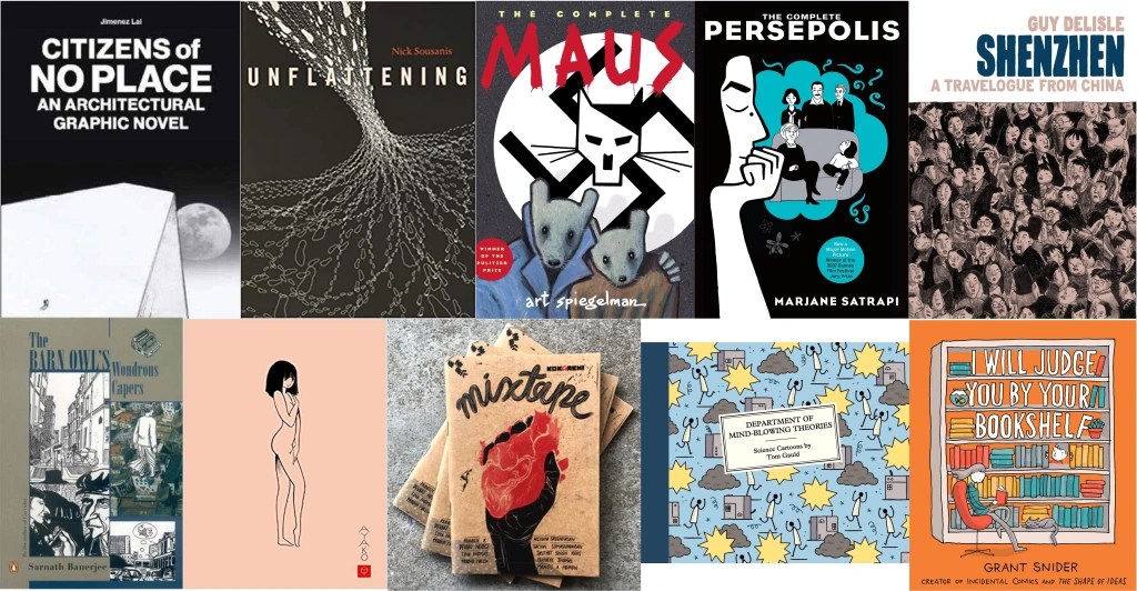
- Citizens of No Place: An Architecture Graphic Novel (Jimenez Lai, Princeton Architectural Press, 2012): In my humble opinion, this is a must-read book for all architects, no matter how young or old. If I had the power, this book would be the first thing a student should read on day 1 of their journey in architectural education. The book is broken into 10 chapters each with a short one-paragraph introduction leading to a story that is imaginative, yet at the same time, presented as if it were plausible.
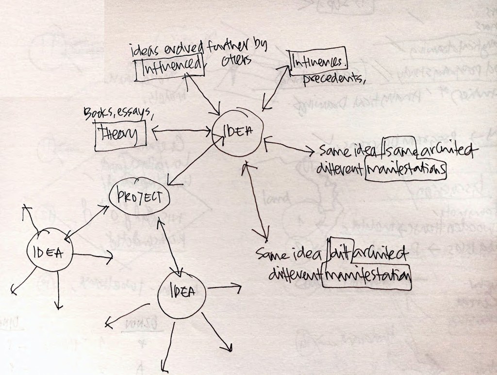
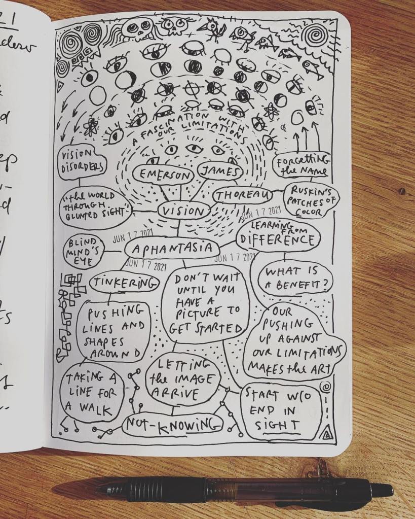
- Unflattening (Nick Sousanis, Harvard University Press, 2021): Though the list started off with an architecture graphic novel, I hope to diversify it as it grows. The book’s description does most of the job when it says, “The primacy of words over images has deep roots in Western culture. But what if the two are inextricably linked, equal partners in meaning-making? Written and drawn entirely as comics, Unflattening is an experiment in visual thinking.” Sousanis uses the graphic or sequential art format to challenge the way we perceive text and images, creating pages that can be read both as a whole or in parts. What is most interesting about this book is that the author shows his process of how he put together the artwork for the chapters as mind maps at the end of the book.
- The Complete Maus (Art Spiegelman, Penguin UK, 2003): We have all heard and seen stories of the holocaust and the atrocities wrought upon the Jewish people by Nazi Germany many times over. But, The Complete Maus brings it too close to home. Spiegelman uses the graphic novel format to tell the story of his own father who survived Hitler’s Germany. In this book, people are depicted as anthropomorphised animals; the Jews as mice, the Germans as cats, and the Poles as pigs. Other ethnicities are shown as other animals as they appear in the storyline. The Complete Maus is the only graphic novel to be awarded the Pulitzer Prize.
- The Complete Persepolis (Marjane Satrapi, Pantheon, 2007): In another of my humble opinion, which I seem to have too many of, graphic novels must be read as physical books, held in hand, to appreciate the art work. But, Persepolis was one of those rare books that I happened to read as a pdf on an ipad mini that was way out of date. The book is simple in structure and follows the life of the author in Iran as the country went through its cultural revolution. Reading (or seeing artwork) of this sudden shift in the political tectonics of a nation through the eyes of a child, herself at the cusp of womanhood, is poignant. The artwork itself is simple, bringing the story they tell to the forefront.
- Shenzhen: A Travelogue through China (Guy Delisle, Jonathan Cape, 2017): This book forms part of a series of 4 books, all by the same author and in the same travelogue format, by the author Guy Delisle. He seems to have had the good fortune to have travelled to some of the most restricted and highly sensitive countries in the world. From Shenzhen to Burma, and then to Jerusalem to Pyongyang, Delisle seems to find himself as an outsider looking into places he isn’t supposed to. His style matches the dreariness of the places he visits making the situations he finds himself both hilarious and extremely concerning. The first book I encountered of his was Shenzhen, on recommendation from a friend in Ahmedabad, and loved the story telling so much that I ended up reading all 4 in the series in quick succession.
- The Barn Owl’s Wondrous Capers (Sarnath Banerjee, Penguin Books India, 2007): When Kiran spring cleaned his library, he found a bunch of books he wanted to get rid off. One of those books happened to be Sarnath Banerjee’s book, The Barn Owl’s Wondrous Capers. I snagged the book immediately and happened to read it soon to realise that it was not an easy feat. The story is about a man who goes on a hunt to find a book, through Kolkatta, by the name of The Barn Owl’s Wondrous Capers. The book is about a man trying to look for a book that is in your hands. The whole book is a search for a book. I don’t recall if the man finds the book at the end or not, but the whole premise of searching for a book that is titled the same as the one you are reading is simply mind boggling. This also happened to be my first introduction to Indian graphic novel artists.
- Ayako (Osamu Tezuka, Vertical, 2013): Originally published in Japanese in 1989, the english translation of the book was published much later. Tezuka, I found out only after having read this book, was one of the first artists to contribute to the genre of graphic novels now popularly known as Manga. The story of Ayako is of a girl by the same name born out of incest in a rich land owning family who try to keep her entire existence a secret. She escapes and the story follows her life. The story of Ayako is tragic and triumphant at the same time. For readers of Manga, the artwork will be very familiar.
- Kokaachi: Kokaachi is not a book, but the name of an art studio under which 2 artists (Pratheek and Tina Thomas). They published an anthology named Mixtape, which are 3 books each showcasing stories done by young graphic novel artists. They also make Matchbox Comix, stories so short they fit in an accordion fashion into a matchbox.
- Department of Mind Blowing Theories: Science Cartoon (Tom Gauld, Canongate Books, 2020): Please read this book as a physical copy, never on a kindle. That is the mistake I made and I hope no one repeats it. The book is a series of small cartoons that Tom Gauld had done that were published in newspapers as single or 3 tiled stories. This book is all about science and all the hilarious ways things can go wrong.
- I Will Judge You by Your Bookshelf (Grant Snider, Harry N Abrams, 2020): Another book I made the mistake of reading on Kindle. Well, I would justify this grave mistake by saying that it was the first lockdown and I was bored and desperate to read this book. For a person who reads, this is probably the best book to read. It displays in simple graphics a lot of things that we as readers take for granted. Graphs that show what genres we read to the various silly positions we take to do so, and the weird and the odd place where we read. Though heavily fictionalised, the book is a joy to go through and the cover graphic is cute.


You must be logged in to post a comment.