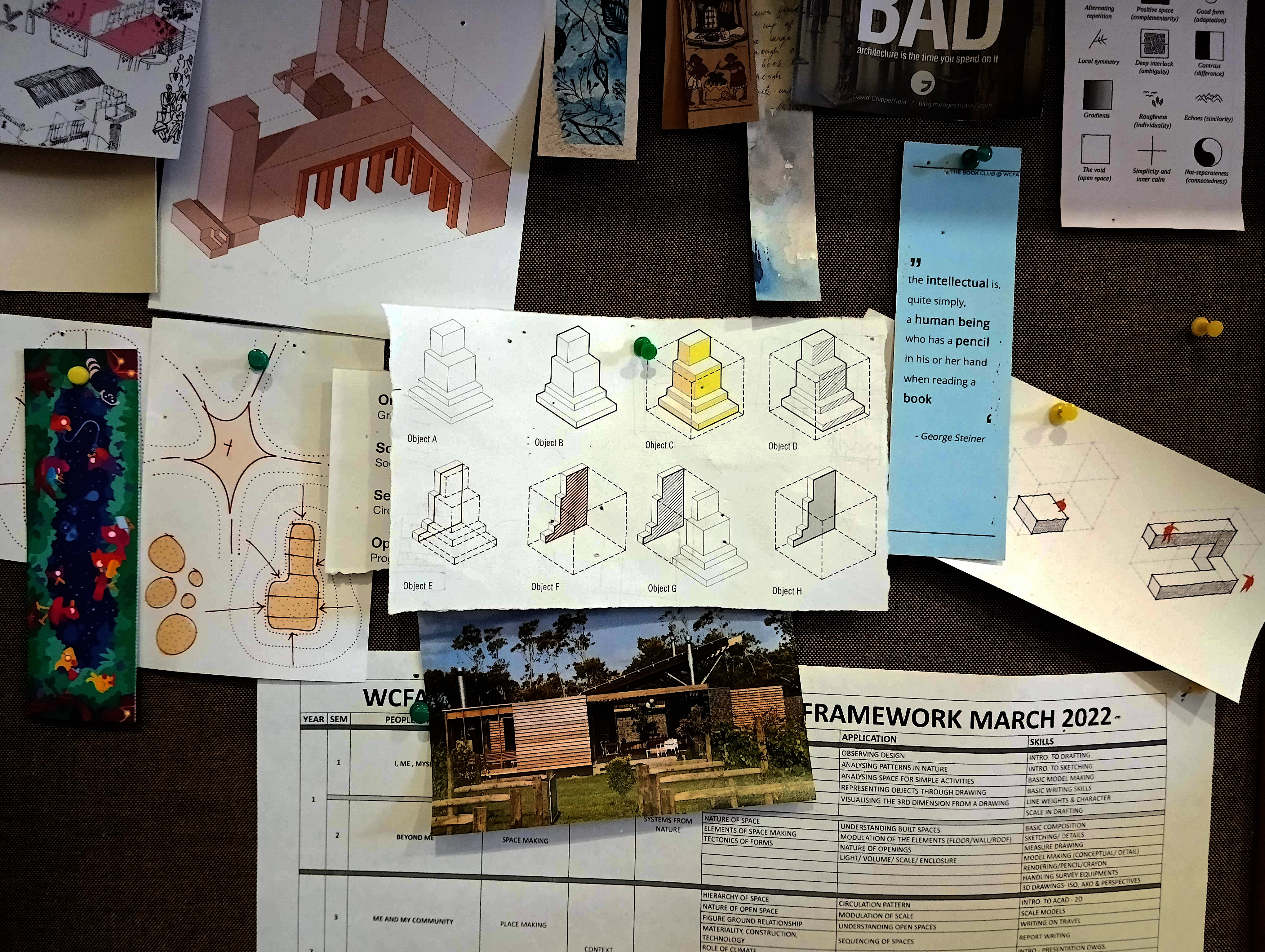
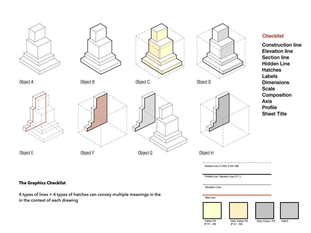
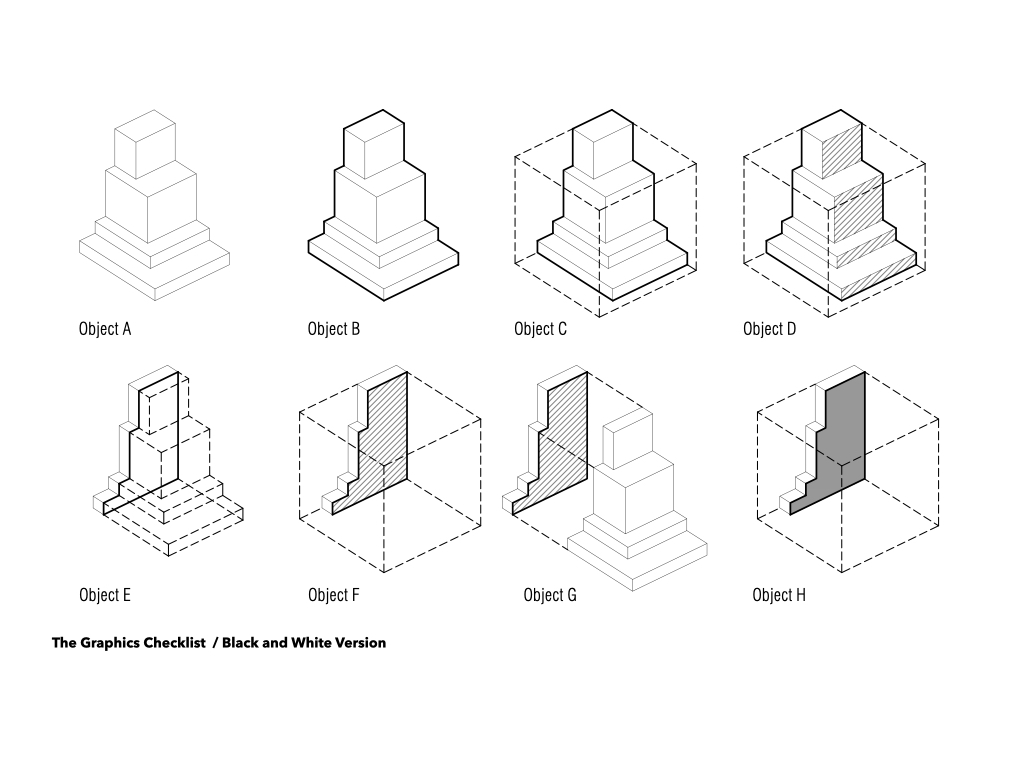
Checklists are the opposite of playlists (which I discussed in a previous blog post). This image above is from my tagboard at college, and the drawing in the center is the ‘Graphics Checklist’. It is a drawing checklist I made many years before and have been using consistently since then. While playlists are playful and flexible, checklists can feel dry, nerdy, and dull. But I appreciate them greatly and use them frequently in my teaching, to the point that my students may grow wary of them. My attachment to checklists likely stems from the frustration of repeatedly teaching basic drafting skills to first-year students and having to reinforce the same principles all the way through their thesis—and often in between.
To streamline this, I introduce the concept of a checklist in their first-semester drafting class and continue to use it as a reference tool whenever I meet them over the next five years. It’s not that these drawing conditions are hard to apply; they’re just easy to forget. Wittgenstein writes “The aspects of things that are most important for us are hidden because of their simplicity and familiarity.” We all rely on checklists, especially when we travel, and in many other contexts. They guide critical processes, from prepping an airplane for takeoff to setting up an operating theater or packing for a trip. Checklists are invaluable.
The book The Checklist Manifesto is one of the trigger to consolidate the fragmented rules into a single and visible narrative. This book is a great narrative on the simple need of lists and how they can be life saving (not exaggerating) – It traces the the birth of the checklist from the early plane (bombers), construction industry, etc. In the book , Gawande writes
“Substantial parts of what software designers, financial managers, firefighters, police officers, lawyers, and most certainly clinicians do are now too complex for them to carry out reliably from memory alone.”
“In a complex environment, experts are up against two main difficulties. The first is the fallibility of human memory and attention, especially when it comes to mundane, routine matters that are easily overlooked under the strain of more pressing events. (When you’ve got a patient throwing up and an upset family member asking you what’s going on, it can be easy to forget that you have not checked her pulse.) Faulty memory and distraction are a particular danger in what engineers call all-or-none processes: whether running to the store to buy ingredients for a cake, preparing an airplane for takeoff, or evaluating a sick person in the hospital, if you miss just one key thing, you might as well not have made the effort at all.
A further difficulty, just as insidious, is that people can lull themselves into skipping steps even when they remember them. In complex processes, after all, certain steps don’t always matter. … “This has never been a problem before,” people say. Until one day it is.
Checklists seem to provide protection against such failures. They remind us of the minimum necessary steps and make them explicit. They not only offer the possibility of verification but also instill a kind of discipline of higher performance.”
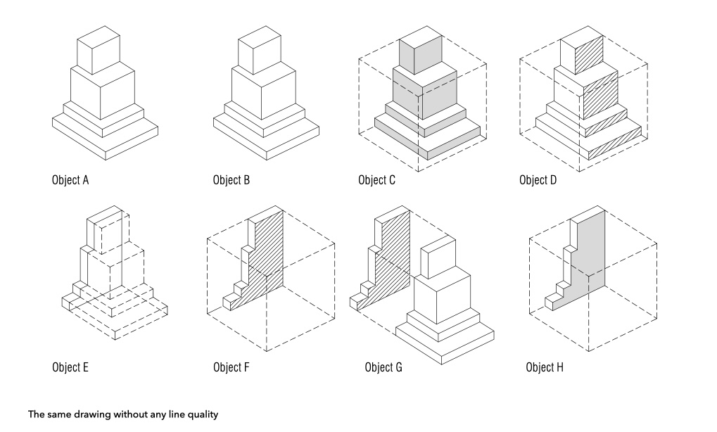
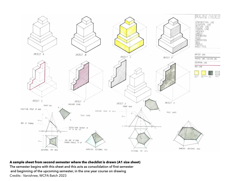
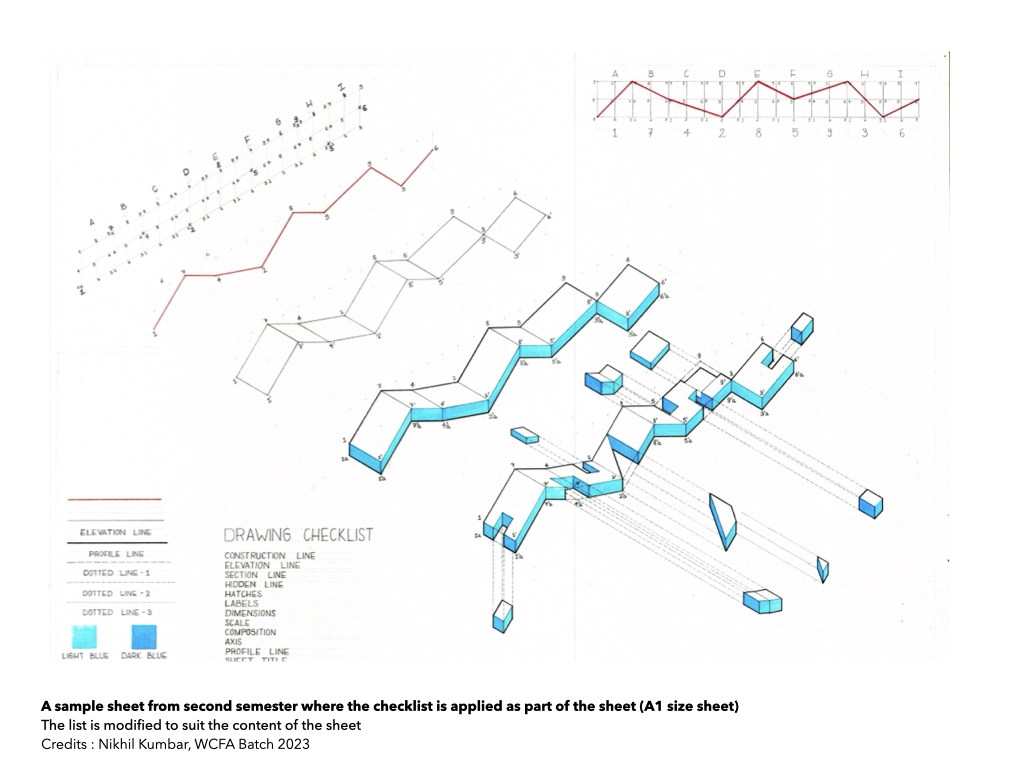
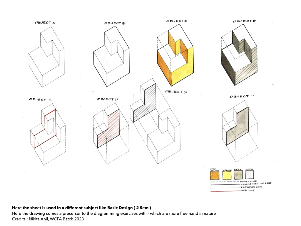
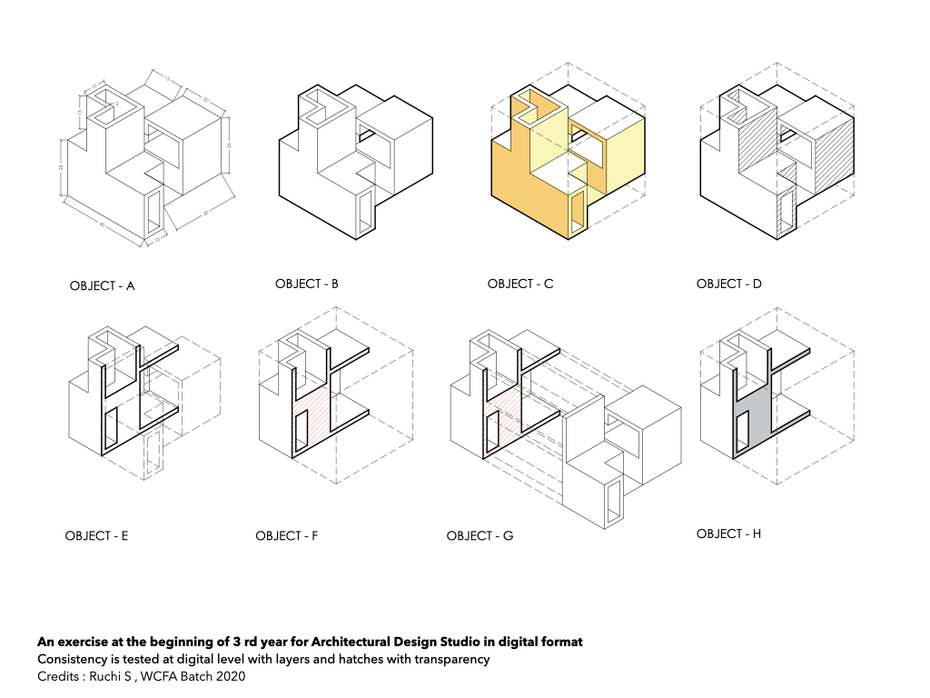
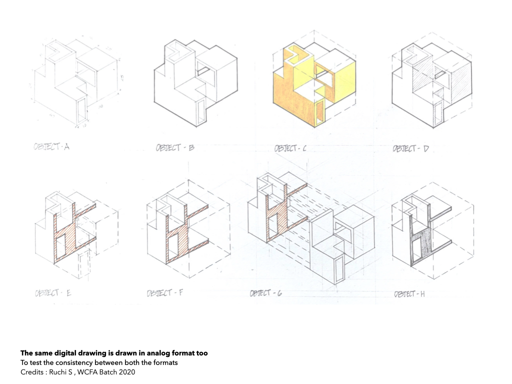
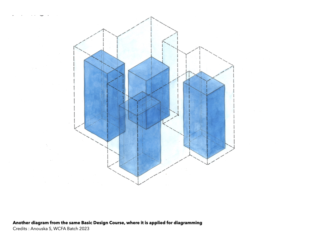
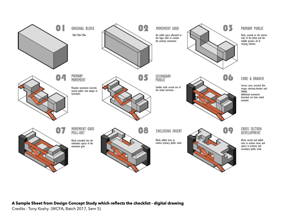
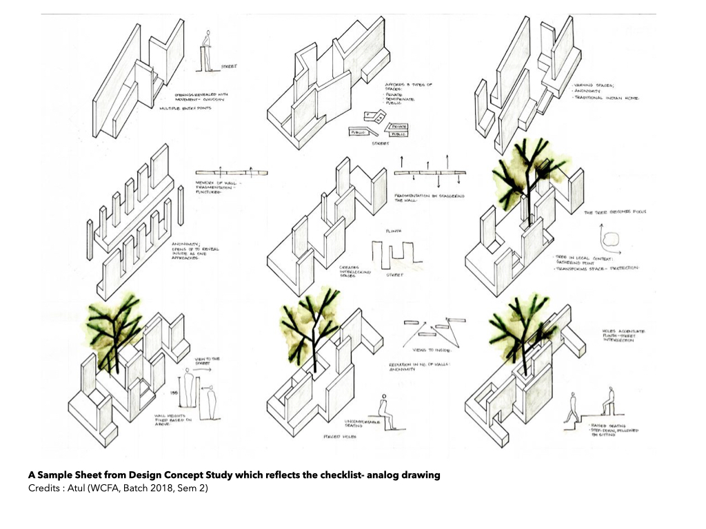
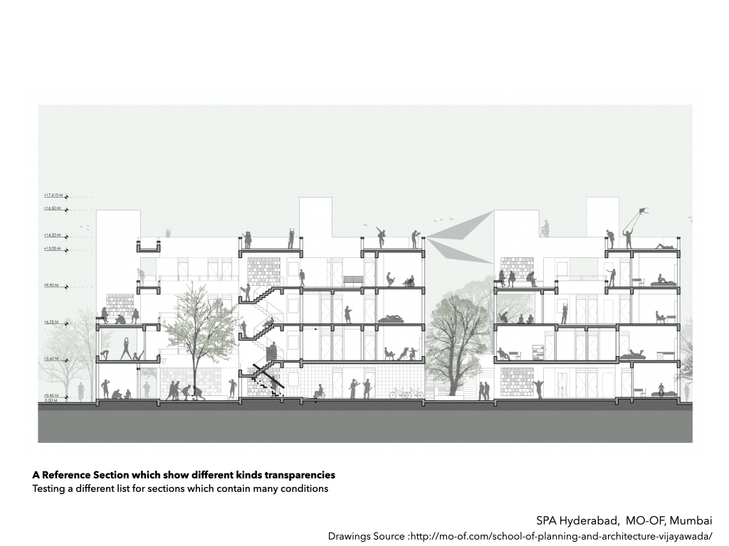
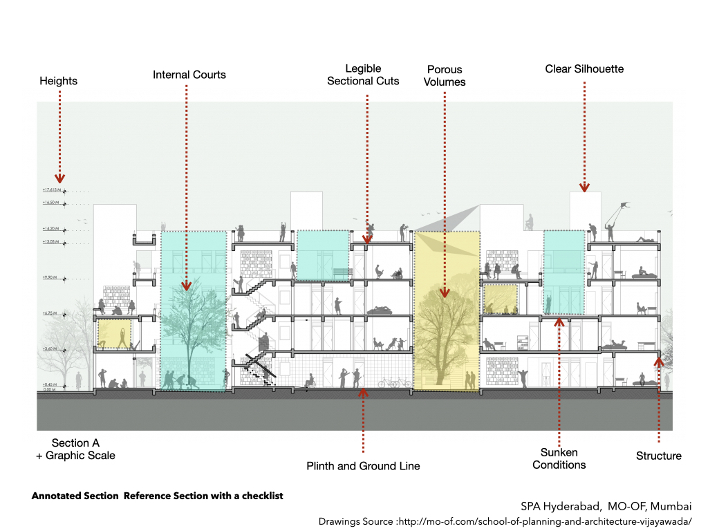
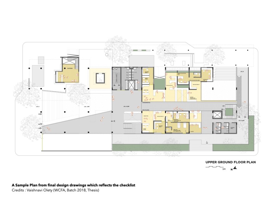
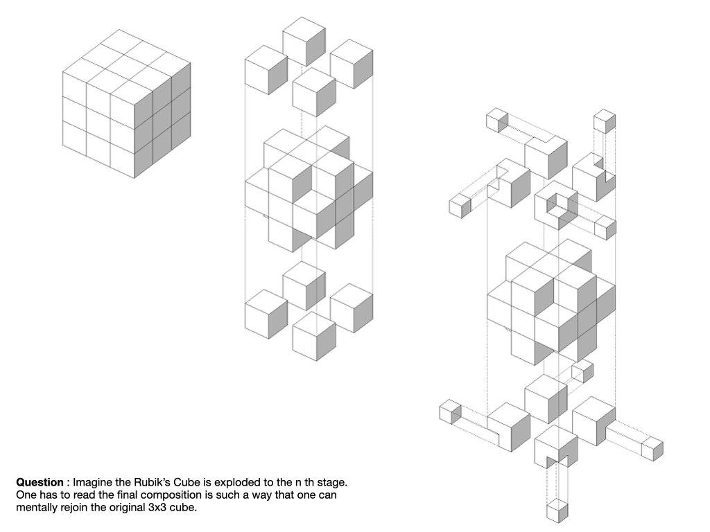
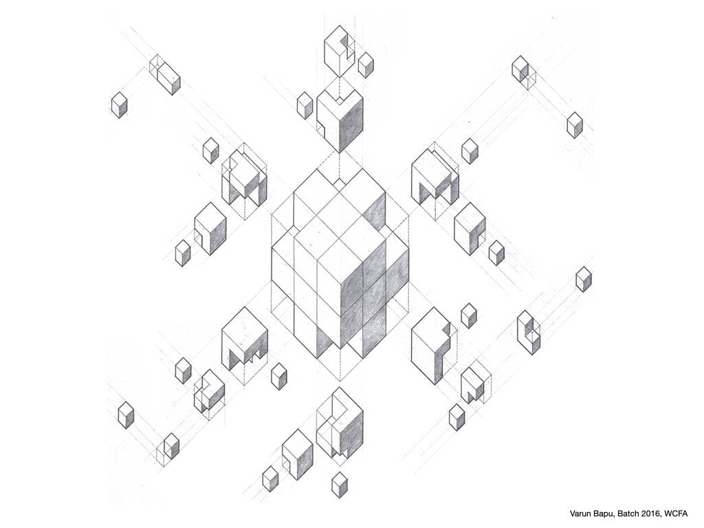
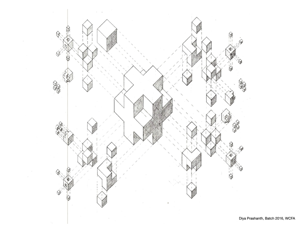
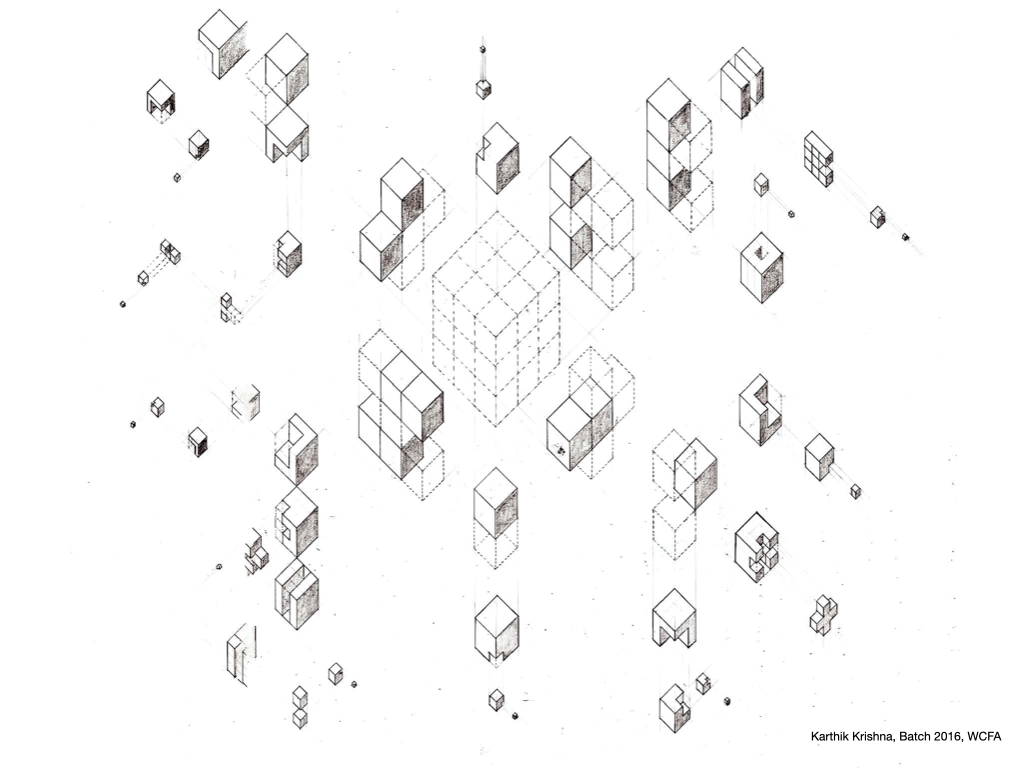
Below is the Graphics Checklist and many variations and reflections in student works at WCFA of it over the years – tested from first year drafting to various other semesters in different forms. Unless credited all the drawings are made by the author of the blog.
I recently bought a car, and one of the pet peeves I discovered was listening to music in a closed space (unlike with headphones). I started making a playlist for my car, and after almost 2 years and 24 songs later, I have a slow-cooked personal playlist that can make and change my mood.
During my school and early college days, I had the delight of making playlists on cassettes. Because one couldn’t afford to buy all the albums, one had to carefully select songs and go to a cassette shop, either choosing a 60-minute or 90-minute cassette and filling it with favorite songs. The logistics, availability, and cost of making the playlist made it precious by default. The playlist was a collection—a place of refuge to spend time with things that were very dear to you.
One of the recent songs I added was ‘O Sanam’ by Lucky Ali. I serendipitously stumbled upon that song recently and had forgotten the calmness it brought me when I listened to it a decade and a half ago. Listening to the song now brings back those feelings. I am enjoying my 24-ish songs so warmly. When I am distracted, I play the list in the order I have decided; if I want to have some fun, I just shuffle—a delight when you don’t know which is your next song.
Why write about playlists now, and that too when they are easy to make? Just right-click and add it to a playlist. Yes, that’s the point: it’s easy, and it is too easy. You can add a thousand songs to a list and make a hundred lists on ten devices with just a few clicks. You don’t have to find a cassette shop that has stocked all A R Rahman albums in Tamil version, and if you found one, it would become a sanctuary.
Now, the playlist has to become a filter to resist the overloaded world. If I am not wrong, it is philosopher Søren Kierkegaard who said we are tranquillized by the trivial.
Why is this important? It is important because I can get overwhelmed even if I have six tabs open in my browser. (One of my students had 24 tabs open, and I think she had another window with more tabs open, which she didn’t show me.) This is a true reflection of our time.
Playlists can become tools of resistance. Now I will make this relevant by placing it in the context of this blog, where topics are generally related to architecture (though I hope to deviate when needed). The playlist should be very personal—so personal that you should not share it either. I will follow that here and not share my full playlist, not because it is a secret, but because it is personal and not relevant to anyone without the meaning I have attached to it over time. Make a list of references and build a fort around it. Don’t let in or let go of ideas or thoughts without strict scrutiny. When one’s position is attacked, take refuge in the playlist and see if the attack is constructive and borrow something from it.
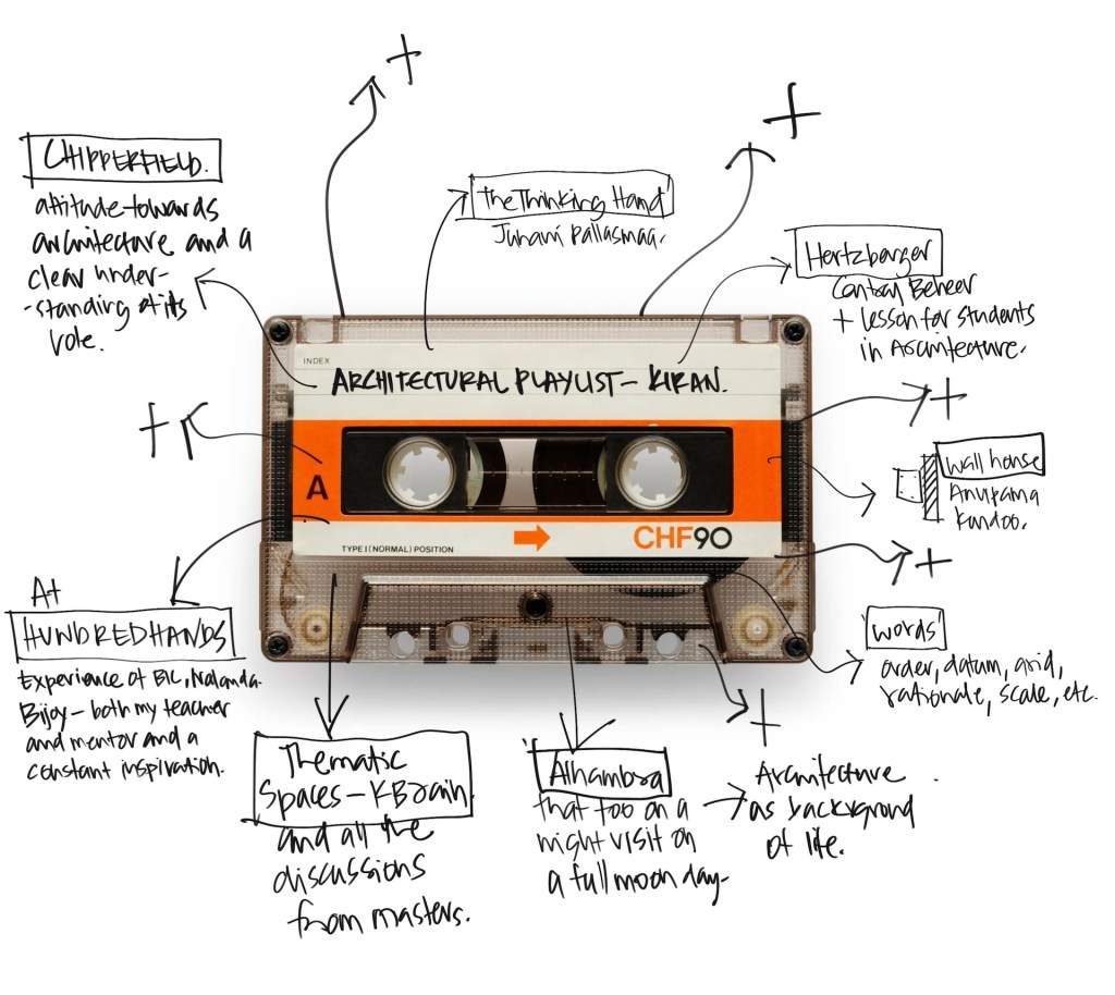
My playlist will contain projects I visited and relished (like Alhambra in Spain—a night visit on a full moon day), projects I adore analyzing (such as Wall House by Anupama Kundoo), words that thrilled me as a student (like order), books I wish I had known in my first year—not in my final year or master’s (Lessons for Students in Architecture by Herman Hertzberger), books I wish I could rediscover and want to read freshly every time (The Thinking Hand by Juhani Pallasmaa), definitions or quotes on theory, drawings, and design; memories of being in architecture and being moved calmly by it, memories and generosity of my teachers and mentors, specific dialogues with friends and students, a little detail I admire, a material finish I enjoy, the unique smell of my grandfather’s grocery store at my native place, etc.
My playlist consists of things I resonate deeply with, not just a shallow list of things I like (that is easy). One needs to dig deep. I am not talking about bookmarks in ArchDaily, saved items on Pinterest and Instagram. I am talking about things that hold significant value in one’s own journey. This playlist needs to be visible or accessible on an everyday basis.
Being a teacher, what I teach becomes a sort of playlist in itself. I have found other uses for the list as a teacher. I decide the precedent studies in class, so I can be sharp about my argument and it can become a common ground for discussions in class. I think young architects can also benefit from this, as their Instagram (like mine) constantly bombards them with interesting and useful information at an unfathomable rate. Social media has the nature to make us feel inadequate. It is never enough. Anne Lamott beautifully says, “Try not to compare your insides to other people’s outsides. It will only make you worse than you already are.” Social media gives this feeling on a platter. I try to use the playlist as a piece of resistance to that.
I casually made a note on the differences between case studies and precedents in a lecture. Case studies are made out of need—to tackle a problem or situation. Precedents, I think, are perennial, long-term. That list can bring a moment of calmness and joy when one engages with it. When one is lost, it can become a guidepost to not lose hope and affirm one’s pursuit in architecture.
Note : Used AI help only to check grammar (which seems like a very useful tool – when used carefully)
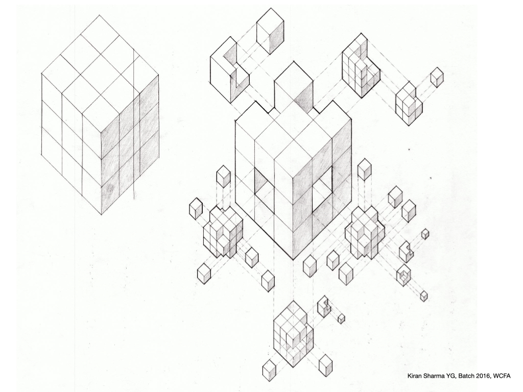
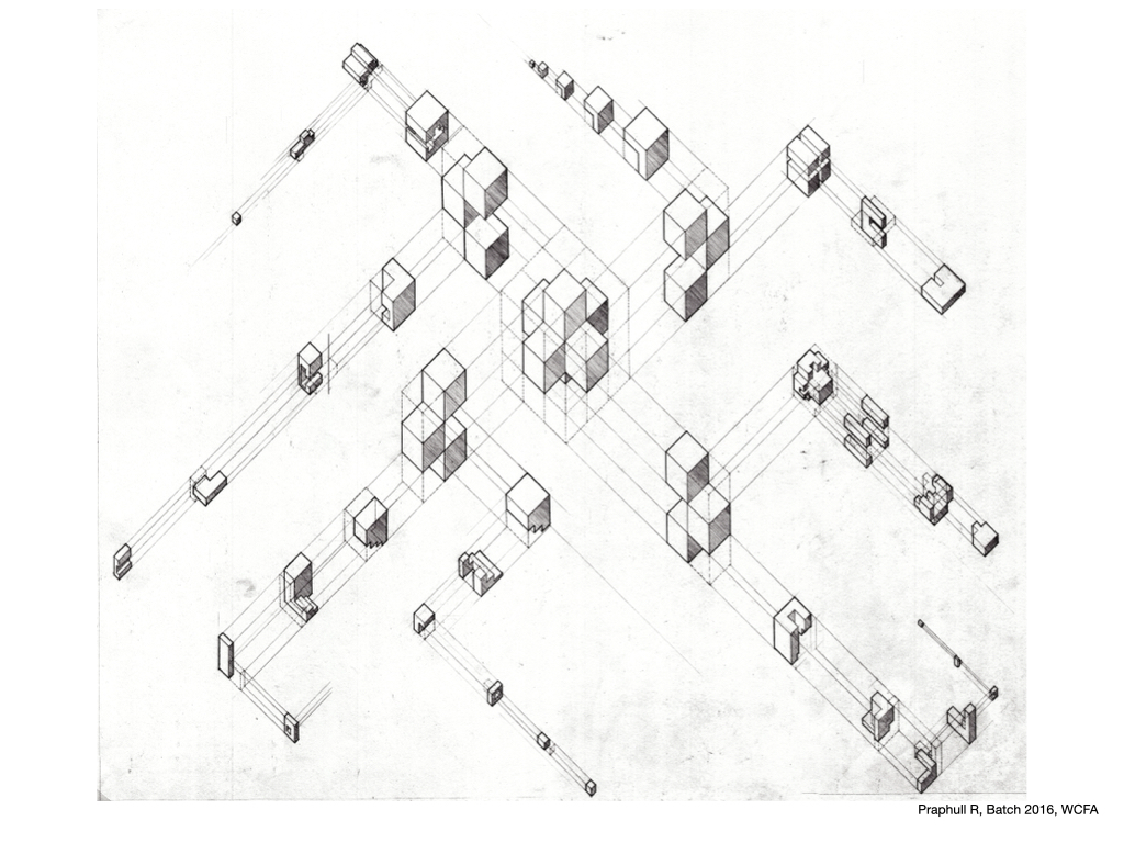
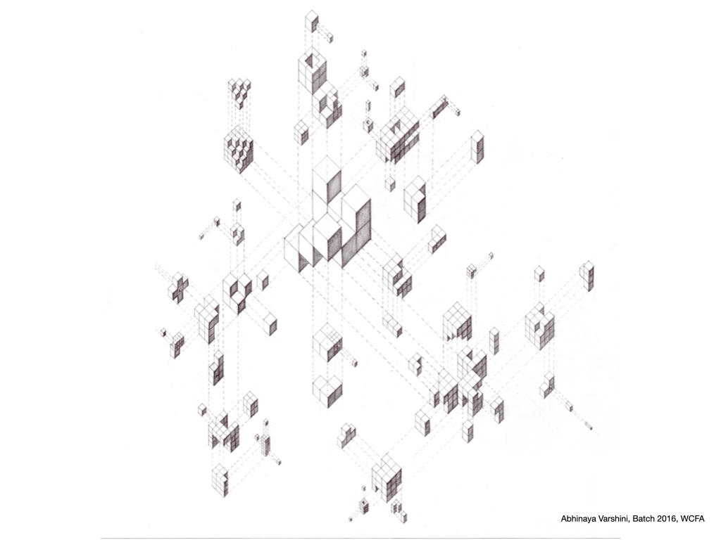
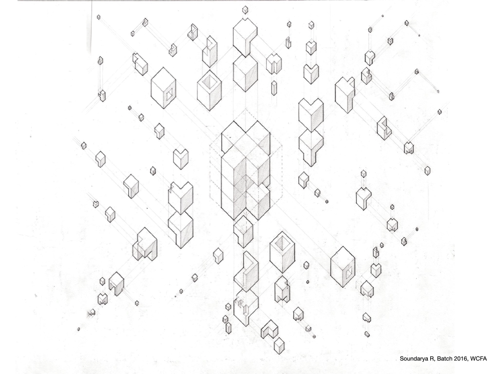
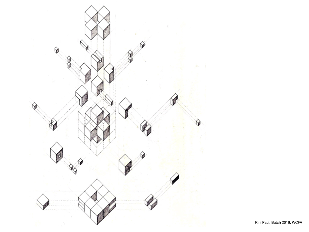
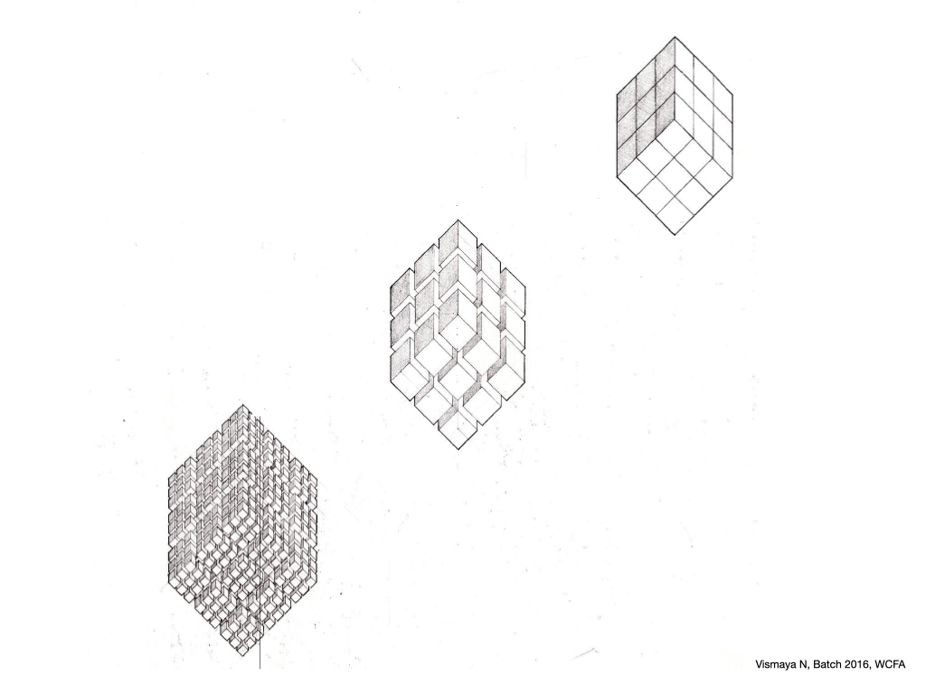
This exercise is one of my favorite problems to give second-semester drawing students. It serves as a reminder and recall of the fundamentals learned in the first semester.
Elsewhere, I’ve written about this exercise: “This drawing exercise explores the possibilities of the exploded axonometrics technique. It involves exploding an imaginative Rubik’s cube in multiple stages, with each stage leaving a trace of its path. To start the drawing, one does not need to know exactly how it will end. The composition shapes itself as the drawing progresses. This method illustrates a wonderful quote on writing by E. L. Doctorow: ‘Writing is like driving at night in the fog. You can only see as far as your headlights, but you can make the whole trip that way.’“
This also connects to a brilliant quote by Brian Eno. ““Try to make things that can become better in other people’s minds than they were in yours ” He wrote this in the context of conceptual art and music, which perfectly fits what teaching means to me
All the drawings are from WCFA Batch 2016. Co Faculty : Rishi
I teach Architectural Theory to both first and second-year undergraduate students at the college. When delving into this particular subject, I am acutely aware that I belong to a small tribe of history and theory educators in the country. I find it crucial to articulate to my students the significance of this subject. Regardless of the topic, I always carve out a space to underscore why a subject holds importance, as it substantially enhances the learning experience. In the case of theory, this practice propels discussions to a higher intellectual plane.
Reflecting on my postgraduate course at CEPT, which was centered around theory, I can’t distinctly recall if we explicitly delved into the definition and essence of theory. However, through years of imparting this subject, I have developed a repertoire of tropes that I employ in class, elucidating the reasons for studying theory. One of the most compelling perspectives, in my opinion, is “theory as an organising tool.” This realization has been a guiding principle, shaping the way I approach and teach architectural theory. This principle not only guides in teaching, but also in dealing with the infomation overload and find a way to navigate in between them.
I completely resonated and borrowed this phrase from an Malcolm Gladwell’s interview:
Interviewer: “That’s why reviewers say you bring “intellectual sparkle to everyday subjects”. Is this a deliberate approach? Yeah, it’s deliberate. I’ve often observed that people are experience-rich and theory-poor. All of us have an enormous wealth of stories and experiences. But what we lack is the means to make sense of all that, to organise it, to understand it and to comprehend it. My books are addressing that. I’m not telling you facts you didn’t know before. You’ve all been in situations I’m describing. What I’m doing is saying, here’s a way of organising your thoughts.” (bold emphasis mine)
In this post, I will share some examples which indicate the possibilities of this trope “theory as an organising tool”
01.
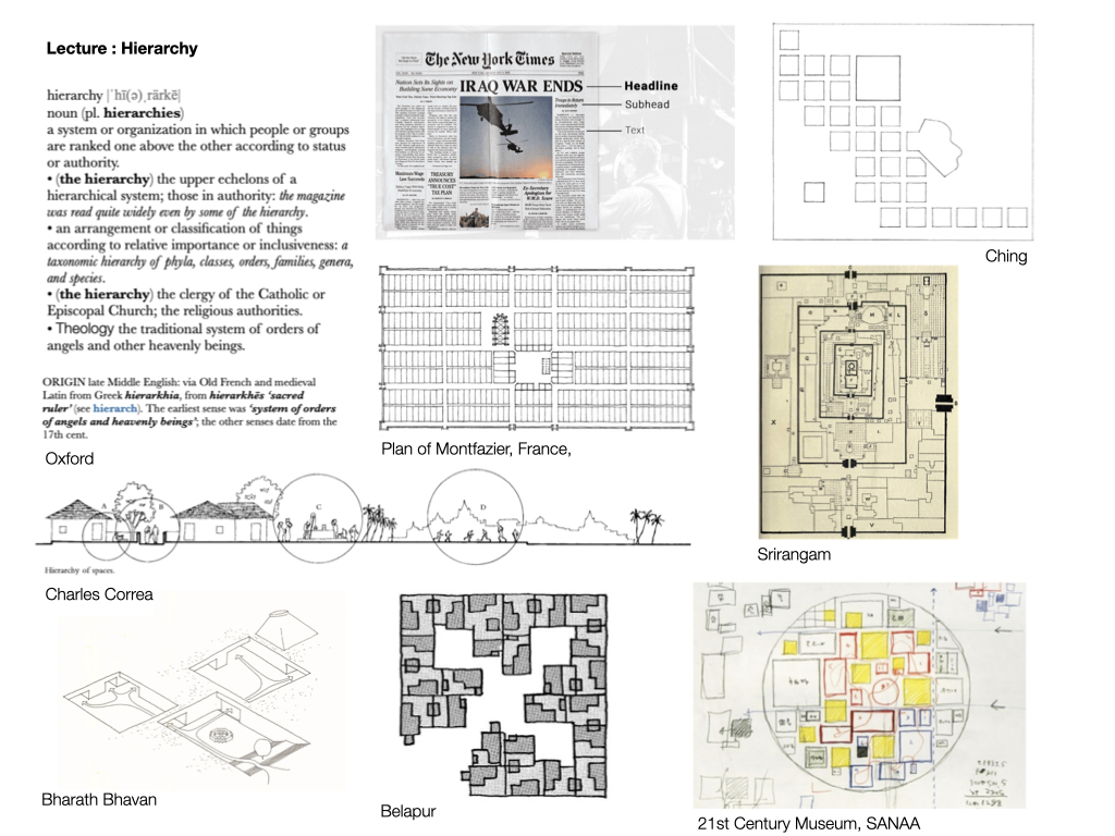
Lectures serve as vessels for ideas. For instance, in preparing a lecture on hierarchy, I have the opportunity to seamlessly organise diverse examples—from dictionaries, graphics design principles to instances in Indian history, contemporary scenarios in Japan, and insights from figures like Charles Correa—all under the same conceptual umbrella. This unique condition allows me to curate examples and weave a steady narrative to explain and unpack the meaning of the term ‘hierarchy’. In contrast to history lectures, which are constrained by specific styles, periods, or movements, theory lectures open up a broad spectrum of possibilities and interpretations.
02.
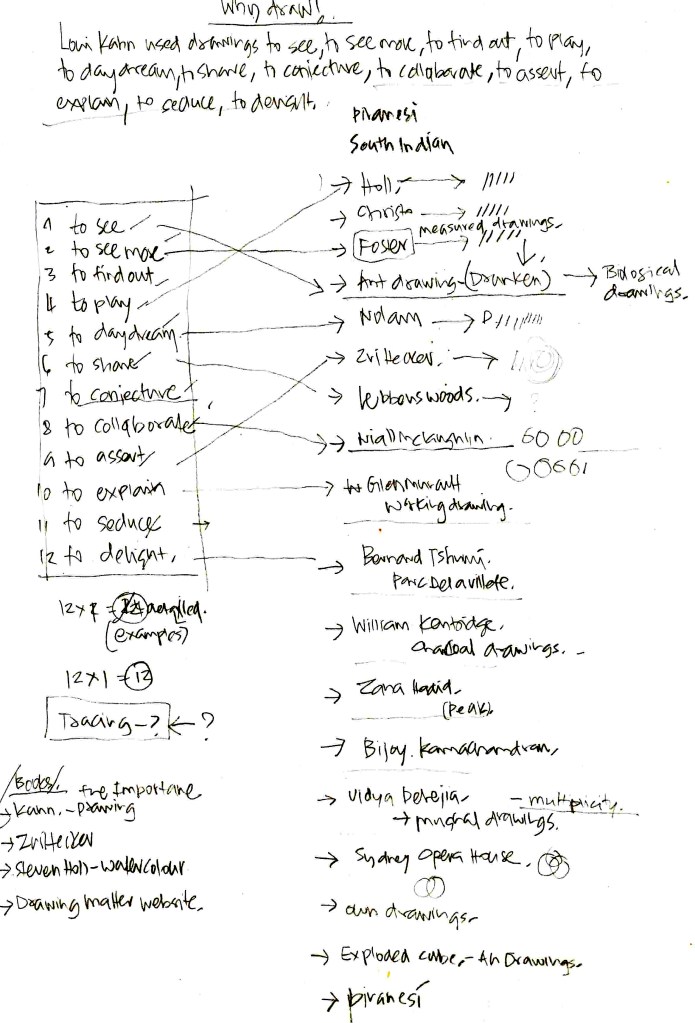
The research was conducted for a lecture titled ‘Why Draw’ presented to first-year students. The lecture was inspired by a quote from Michael Merill’s book ‘The Importance of Drawing’, which served as the framework. I used this quote and my knowledge of various examples to craft an engaging narrative. Instead of starting from scratch, I utilized my existing drawing references and matched them with keywords from the quote. My primary focus was to recognise that this quote could form the backbone of the lecture, saving valuable time.
03.
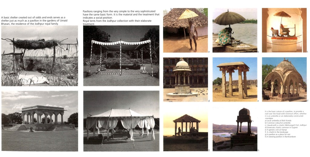
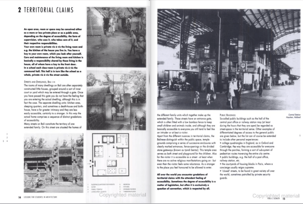
This excerpt from ‘Thematic Spaces in Indian Architecture’ is crucial to me. Prof. Jain delves into the concept of a pavilion, navigating between its “nothingness” and “universal” significance. Although I was privileged to study under Prof. Jain, I only realized the full potential of this perspective later on. This way of looking at things had already seeped into my subconscious during my student days.
04.
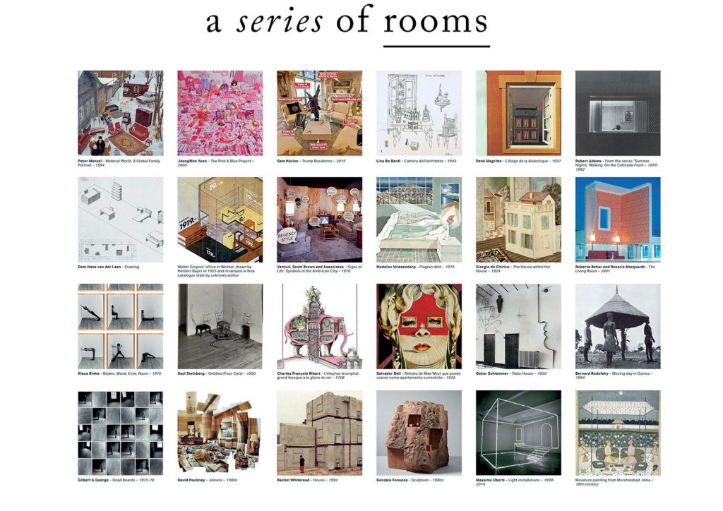
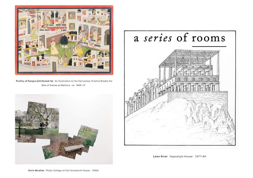
This collection ‘A Series of Rooms‘ is one of my favorite online collections. It is “a collection of domestic space – an exploration into the imagery of the housing archetype – as portrayed in art, media, and human studies.” Their Insta page surprises me with the type of instances they gather from various mediums. The curators (Bonell+Dòriga) mention that “In the oversaturated age of digital reproducibility, building one’s own archive – searching, selecting, organizing – becomes, beyond being an instrument in the design process, a creative act in itself.” I am in complete agreement with this idea. Otherwise, how can we speak on the same page about diverse examples like Enric Miralles’ collage of Farnsworth House, Krier’s experimentations, and Mughal miniature paintings.
05.
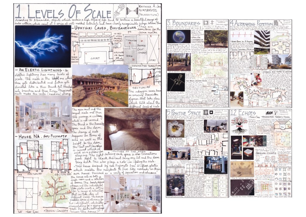
In this case, this is a student assignment. Here the exercise is to reinterpret Christopher Alexander’s fundamental principles and collect various examples – one from personal experience, one from examples studied, and other scientific phenomena. Krithika (WCFA Batch 2018) organized her experiences under this term and gave a discernible shape to her ideas.
06.
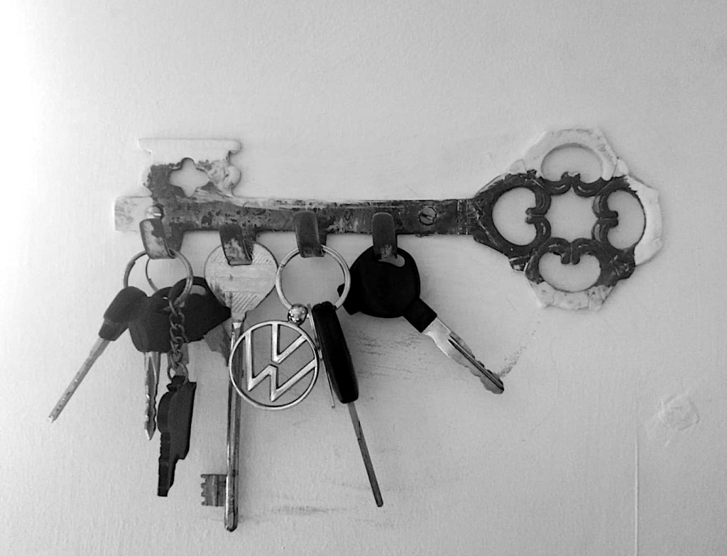
I want to share a personal experience. I used to constantly misplace my keys at home, causing me to waste time searching for them. When I moved to a new house, I found a key hanger in the shape of a key! This simple solution made it easy for me to develop a habit of always placing my keys there. Additionally, I made it a nightly routine to ensure all the keys were in their proper place. Since then, I rarely lose any keys and avoid frantic last-minute searches before leaving the house. The analogy I’m suggesting is similar: when you get an idea or find a reference, “hang” it in the right place so you can easily find it when needed.
07.
If you’ve reached this part of the post and found the trope interesting, I bet you’ll find this book intriguing. I’ve already read this book twice this year and gifted it to a few friends. Here is a quote from the book: “keep only what resonates…When something resonates, it moves you on an intuitive level. Often, the ideas that resonate are the ones that are most unusual, counterintuitive, interesting, or potentially useful. Don’t make it an analytical decision, and don’t worry about why exactly it resonates- just look inside for a feeling of pleasure, curiosity, wonder, or excitement, and let that be your signal for when it’s time to capture a passage, an image, a quote, or a fact. “
08.
As I wrapped up this post, I couldn’t resist mentioning the timeless classic ‘Lesson for Students in Architecture’ by Hertzberger! This wonderful book is a collection of precedents he has continuously taught, practiced, and referred to throughout his entire career. The book starts with the line “It is inevitable that the work you do as an architect should serve as the point of departure for your teaching, and obviously the best way to explain what you have to say is to do so on the basis of practical experience: that, indeed, is the common thread of this book. Instead of presenting each individual work separately and explaining all their distinctive features in turn, the different textual components have been organized in such a way that, as a whole, they offer something in the way of a theory; it is the way the elements are organized that transforms practice itself into theory.”
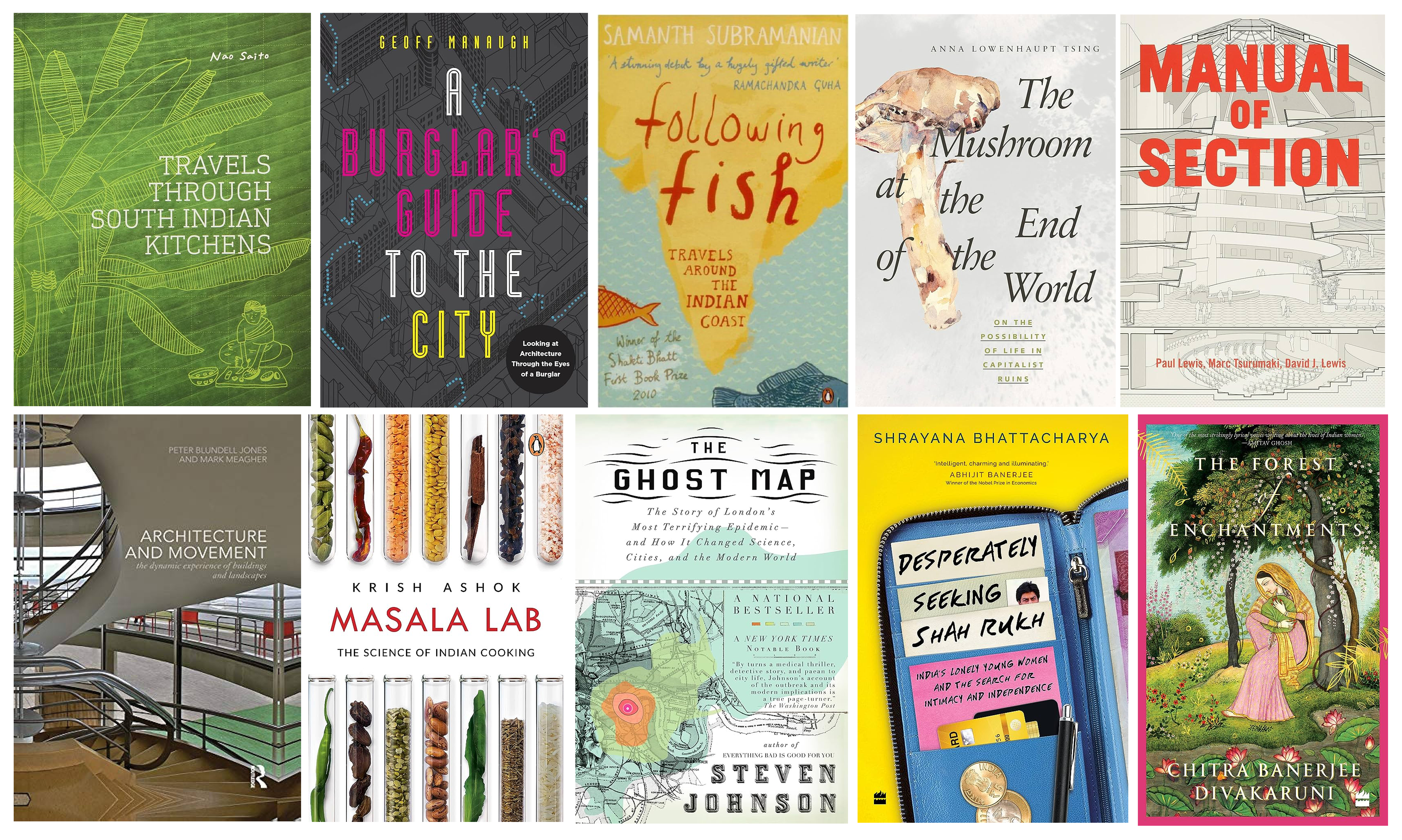
10 books, each with a lens. (Click on the image for a larger view)
For this post I have put together a list of 10 books, which from my point of view, have a distinct lens in each of them. (I am hoping somebody will get the pun) Looking at the world through a lens is a softer way to interact in an ever-growing opinionated landscape. It is accommodative and one can stand firm in the way one is looking at the world, simultaneously considering that there are equally engaging ways to view the world. Lenses can help us to write an essay or a book, do a research thesis or a phd, put a lecture together or have a meaningful discussion with a friend. It can work at different scales. I think this trait I carry comes from my training as a student of history and theory. This approach did not arrive in a straightforward and obvious manner but in a gentle and laboured way. Here I am sharing a list of books which have distinct lenses which hold the structure of the book. The lens has allowed the author to engage with their field (many a time across many disciplines) with an oblique and absorbing approach.
As a disclaimer this list contains books I have read many times, read once, yet reading and yet to read. Putting the list is openly committing myself to finish reading all these books soon.
Here is short description / extract from the book, which give a quick glimpse of the book (all emphasis mine) :
1. Travel Through South Indian Kitchens, Nao Saito :In this book the lens of the kitchen becomes a wonderful point of entry into insightful cultural study. Nao Saito uses her architectural training to draw the kitchens she visits. The kitchens become a portal for the author to understand a contrasting culture, which is very different from her own. Nao Saito blends texts, drawings, photos. She writes of her experience of being in the kitchen with the person cooking. The book also contains the recipe of the dish which was made during her visit. The photos are sort of a collage of the event of cooking. The beautiful drawings capture the mood of the place.
Extract from the Introduction: “This book is the result of that three month stay. In these pages, I’ve tried to capture the air I breathed during that time, but through a particular lens: the kitchen. The idea to focus my experience around kitchens arose serendipitously, when I walked into the cooking area of my apartment in Chennai. It was familiar, but also quite strange. I’ve always been interested in food and kitchen tools and this, combined with my interest in architecture and people, gave rise to the idea behind this project: I wanted to travel through a place not by exploring its public spaces, but through the heart of people’s homes -their kitchens. I wanted to focus not only on architecture, but also capture a lived sense of space, cooking, people and conversation. For a traveller, a household kitchen in an alien land is a remote place, something she rarely encounters. Yet each of us has a kitchen at home, and we associate it with distinctive scents, tastes, conversation, laughter, and perhaps also solitude. And this makes it possible for us to actually reach out and try to understand what is going on in a kitchen in a faraway land. “
2. A Burglars Guide to the City, Geoff Manaugh : This book has a delightful structure : architecture and city seen through the eyes of a burglar. If you are an architect + fan of heist movies (like me), this book is a perfect companion.
From the Back Cover: “Studying architecture the way a burglar would, Geoff Manaugh takes readers through walls, down elevator shafts, into panic rooms, and out across the rooftops of an unsuspecting city. At the core of A Burglar’s Guide to the City is an unexpected and thrilling insight: how any building transforms when seen through the eyes of someone hoping to break into it. Encompassing nearly 2,000 years of heists and break-ins, the book draws on the expertise of reformed bank robbers, FBI Special Agents, private security consultants, the L.A.P.D. Air Support Division, and architects past and present. Whether picking locks or climbing the walls of high-rise apartments, finding gaps in a museum’s surveillance routine or discussing home invasions in ancient Rome, A Burglar’s Guide to the City ensures readers will never enter a bank again without imagining how to loot the vault or walk down the street without planning the perfect getaway.“
3. Following Fish; Travels Around in the West Coast, Samanth Subramaniam : This is the key book which led to the curating this post. A book with a seemingly simple title. It starts with eating fish and i assumed the whole book will be about eating fish. But then the book deviates into more delicious territories. It gives a cross section of costal culture in India. As a creative process too, this book gives me so much hope. The hope to grow a rich and layered narrative from a seemingly undemanding and elementary start with a fish.
Extract From the Publishers Note : ” In a coastline as long and diverse as India’s, fish inhabit the heart of many worlds – food of course, but also culture, commerce, sport, history and society. Journeying along the edge of the peninsula, Samanth Subramanian reports upon a kaleidoscope of extraordinary stories. In nine essays, Following Fish conducts rich journalistic investigations: among others, of the famed fish treatment for asthmatics in Hyderabad; of the preparation and the process of eating West Bengal’s prized hilsa; of the ancient art of building fishing boats in Gujarat; of the fiery cuisine and the singular spirit of Kerala’s toddy shops; of the food and the lives of Mumbai’s first peoples; of the history of an old Catholic fishing community in Tamil Nadu; of the hunt for the world’s fastest fish near Goa. Throughout his travels, Subramanian observes the cosmopolitanism and diverse influences absorbed by India’s coastal societies, the withdrawing of traditional fishermen from their craft, the corresponding growth of fishing as pure and voluminous commerce, and the degradation of waters and beaches from over-fishing. Pulsating with pleasure, adventure and discovery, and tempered by nostalgia and loss, Following Fish speaks as eloquently to the armchair traveller as to lovers of the sea and its lore.”
4. The Mushroom at the End of the World: On the Possibility of Life in Capitalist Ruins, Anna Lowenhaupt Tsing : In this book the anthropologist Tsing weaves a narrative on the challenges of capitalism through the story of the surviving trade of single species of the mushroom.
From the cover ” Matsutake is the most valuable mushroom in the world—and a weed that grows in human-disturbed forests across the northern hemisphere. Through its ability to nurture trees, matsutake helps forests to grow in daunting places. It is also an edible delicacy in Japan, where it sometimes commands astronomical prices. In all its contradictions, matsutake offers insights into areas far beyond just mushrooms and addresses a crucial question: what manages to live in the ruins we have made? A tale of diversity within our damaged landscapes, The Mushroom at the End of the World follows one of the strangest commodity chains of our times to explore the unexpected corners of capitalism. Here, we witness the varied and peculiar worlds of matsutake commerce: the worlds of Japanese gourmets, capitalist traders, Hmong jungle fighters, industrial forests, Yi Chinese goat herders, Finnish nature guides, and more. These companions also lead us into fungal ecologies and forest histories to better understand the promise of cohabitation in a time of massive human destruction. By investigating one of the world’s most sought-after fungi, The Mushroom at the End of the World presents an original examination into the relation between capitalist destruction and collaborative survival within multispecies landscapes, the prerequisite for continuing life on earth.“
In another place : Anna Tsing writes “My favourite thing about anthropology is its ability to go back and forth between what you rightly identify as ‘ordinary, lived detail’ and ‘abstract frames of intelligibility’. To me, it’s the best gift of the discipline, the feature I am most passionate about sharing with my students. The best anthropology does not merely add scraps of information to the stockpile of scholarly knowledge; it asks big questions. At the same time, abstract thought alone is not enough. It is in the encounter between the details of life and the big questions that anthropologists find their insights”
This book is a manifestation of this idea.
5. Manual of Section, Paul Lewis, Marc Tsurumaki, and David J. Lewis : This book contains architectural sections of sixty three significant built projects. This book has been instrumental to me in the studio on how to think about and explore sections – “which is often understood as a reductive drawing type produced at the end of the design process” . This book has allowed me to discuss architectural form and experience in dynamic and constructive way.
From the Introduction : “What are the different types of section, and what do they do? How does one produce those sections? Why would one choose to use one configuration of section over another? This book explores these questions and provides a conceptual, material, and instrumental framework for understanding section as a means to create architecture…forces. Moreover. the section is the site where space, form, and material intersect with human experience establishing most clearly the relationship of the body to the building as well as the interplay between architecture and its context.“
6.Architecture and Movement; the Dynamic Experience of Buildings and Landscapes, Peter Blundell Jones, Mark Meagher : Similar to the Manual of Section book. Here movement becomes lens to understand architecture. When it comes to movement, generally the book is heavy on Corbusier and ‘Architectural Promenade’ but this book goes beyond that to Japanese tea ceremonies and multiple situations and theories on movement in architecture.
From the Introduction : “The experience of movement, of moving through buildings, cities, landscapes and in everyday life, is the only involvement most individuals have with the built environment on a daily basis. User experience is so often neglected in architectural study and practice. Architecture and Movement tackles this complex subject for the first time, providing the wide range of perspectives needed to tackle this multidisciplinary topic.Organised in four parts, it:
documents the architect’s, planner’s or designer’s approach, looking at how they have sought to deploy buildings as a promenade and how they have thought or written about it;
concentrates on the individual’s experience, and particularly on the primacy of walking which engages other senses besides the visual;
engages with society and social rituals, and how mutually we define the spaces through which we move, both by laying out routes and boundaries and by celebrating thresholds;
analyses how we deal with promenades that are not experienced directly but via other media, such as computer models, drawings, film and television.”
7. Masala Lab: The Science of Indian Cooking, Krish Ashok : This book is just brilliant. Looks at Indian Food through the lens of science. And why? – Krish Ashok in his own words from the introduction
“By treating our culinary tradition as something sacred, artistic and borderline spiritual, we are doing it a grave disservice. Let me take music as a metaphor here. Indian classical music, one of the most sophisticated artistic traditions in the world, has, I would argue, suffered from the lack of documentation and archiving. In fact, the insistence on purely oral traditions of transmission of knowledge have ended up making the art a very elitist affair not accessible to the wider population. Western music, in contrast, has a simple, visual system of notation that is able to accurately capture every nuance. Because of this, we are able to perform a Bach concerto in exactly the same way as he intended in the eighteenth century. As an amateur musician myself, my teachers would often tell me that Indian classical music cannot be described and documented because its nuances are beyond the ability of language to describe it with fidelity. With due respect, I think that’s bullshit. What we are doing with food is rather similar. By not using the tools and language of modern science and engineering to continuously analyse and document different Indian culinary traditions, and instead just writing down recipes, we are doing the food equivalent of lip-syncing to a pre-recorded track”
This book has completely changed how i look at food and also made cooking a less intimidating act for me.
8. The Ghost Map: The Story of London’s Most Terrifying Epidemic – and How it Changed Science, Cities and the Modern World, Steven Johnson : This is again from one of my favourite authors – Steven Johnson. In this book he uses a single map to weave a story of science, medicine, health, hygiene and human ingenuity.
From the Introduction: “This is a story with four protagonists: a deadly bacterium, a vast city, and two gifted but very different men. One dark week a hundred fifty years ago, in the midst of great terror and human suffering, their lives collided on London’s Broad Street, on the western edge of Soho. This book is an attempt to tell the story of that collision in a way that does justice to the multiple scales of existence that helped bring it about: from the invisible kingdom of microscopic bacteria, to the tragedy and courage and camaraderie of individual lives, to the cultural realm of ideas and ideologies, all the way up to the sprawling metropolis of London itself. It is the story of a map that lies at the intersection of all those different vectors, a map created to help make sense of an experience that defied human understanding. It is also a case study in how change happens in human society, the turbulent way in which wrong or ineffectual ideas are overthrown by better ones. More than anything else, though, it is an argument for seeing that terrible week as one of the defining moments in the invention of modern life.”
9. Desperately Seeking Shah Rukh: India’s Lonely Young Women and the Search for Intimacy and Independence, Shrayana Bhattacharya : This book amalgamates a reading of social structure + pop culture
From the Introduction: “In this pathbreaking work, Shrayana Bhattacharya maps the economic and personal trajectories–the jobs, desires, prayers, love affairs and rivalries–of a diverse group of women. Divided by class but united in fandom, they remain steadfast in their search for intimacy, independence and fun. Embracing Hindi film idol Shah Rukh Khan allows them a small respite from an oppressive culture, a fillip to their fantasies of a friendlier masculinity in Indian men. Most struggle to find the freedom-or income-to follow their favourite actor. Bobbing along in this stream of multiple lives for more than a decade-from Manju’s boredom in ‘rurban’ Rampur and Gold’s anger at having to compete with Western women for male attention in Delhi’s nightclubs, to Zahira’s break from domestic abuse in Ahmedabad-Bhattacharya gleans the details on what Indian women think about men, money, movies, beauty, helplessness, agency and love. A most unusual and compelling book on the female gaze, this is the story of how women have experienced post-liberalization India.”
10. The Forest of Enchantments, Chitra Banerjee Divakaruni : This book is a retelling of an epic we are so familiar. The story is written from the perspective of Sita, and that completely changes the perpspective of the story. A retelling which is both relevant to see the past and present in careful ways.


You must be logged in to post a comment.