
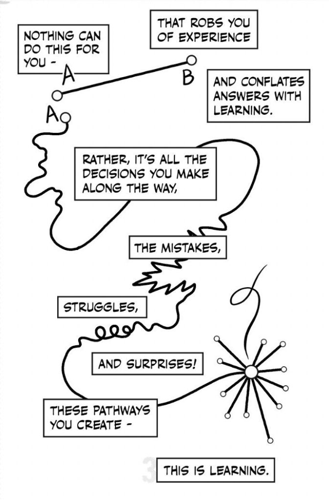
For my second semester here, I am testing notebooks as the primary recorder of the semester’s learning. I am not sure if this is a teachable habit. I came to keeping a notebook rather late. It was at CEPT that I first noticed everyone carrying one, almost as an extension of themselves. It felt like a fertile ground—to note ideas, to hold fragments, to plant seeds for later. A recent sketch by Nick Sousanis (bottom of the this blog post) , on how AI is affecting learning, brought this back to me. In a time when so much is quick, searchable, and already available, there is value in recording ideas by hand, in one’s own way. There is nothing radical about it. Perhaps that is exactly why it feels more important now. I have hesitantly brought this into the lesson plan for the Theory course I teach. I have tried it before and failed, as it takes constant followup and editing. I may be failing at it again. But I still think it matters. I have been introducing the notebook, or the journal, as a base for collecting ideas and finding patterns. It is beginning to seem like a necessary place to hold the rawness of analog teaching—its slowness, its immediacy, and its small surprises.
This is a note I shared with students:
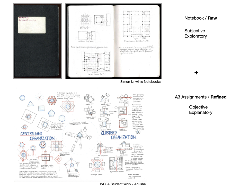
In a time when so much is quick, searchable, and already available, there is value in recording ideas by hand, in one’s own way. There is nothing radical about it. Perhaps that is exactly why it feels more important now. Simon Unwin’s books have been a steady source of hope in this regard. Analyzing Architecture and 25 Buildings Every Architect Should Know come out of reading, and those readings are captured in notebooks—a collection of ideas, thoughts, and observations. It is a simple act, but a powerful one. I also came across two videos on keeping a notebook, and they were quietly encouraging. There was a glimpse into one of his sketchbooks, which he generously shared. It felt like a rare peek into the working mind of an author.
Here are very resourceful links to the videos and notebooks he has generously shared
Video 1 : https://youtu.be/56FoldUYFk0
Video 2 : https://youtu.be/ziHwroH0VXM
And the link to access his note books. http://simonunwin.com/notebooks/entrance.pdf?v=2
More on his website : http://simonunwin.com
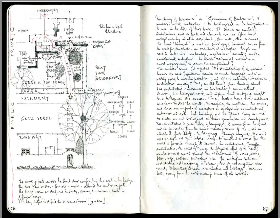
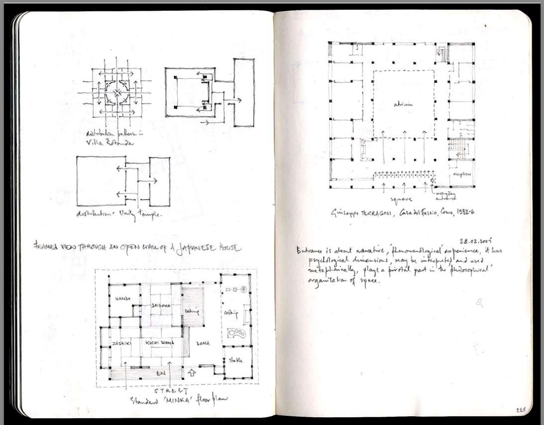
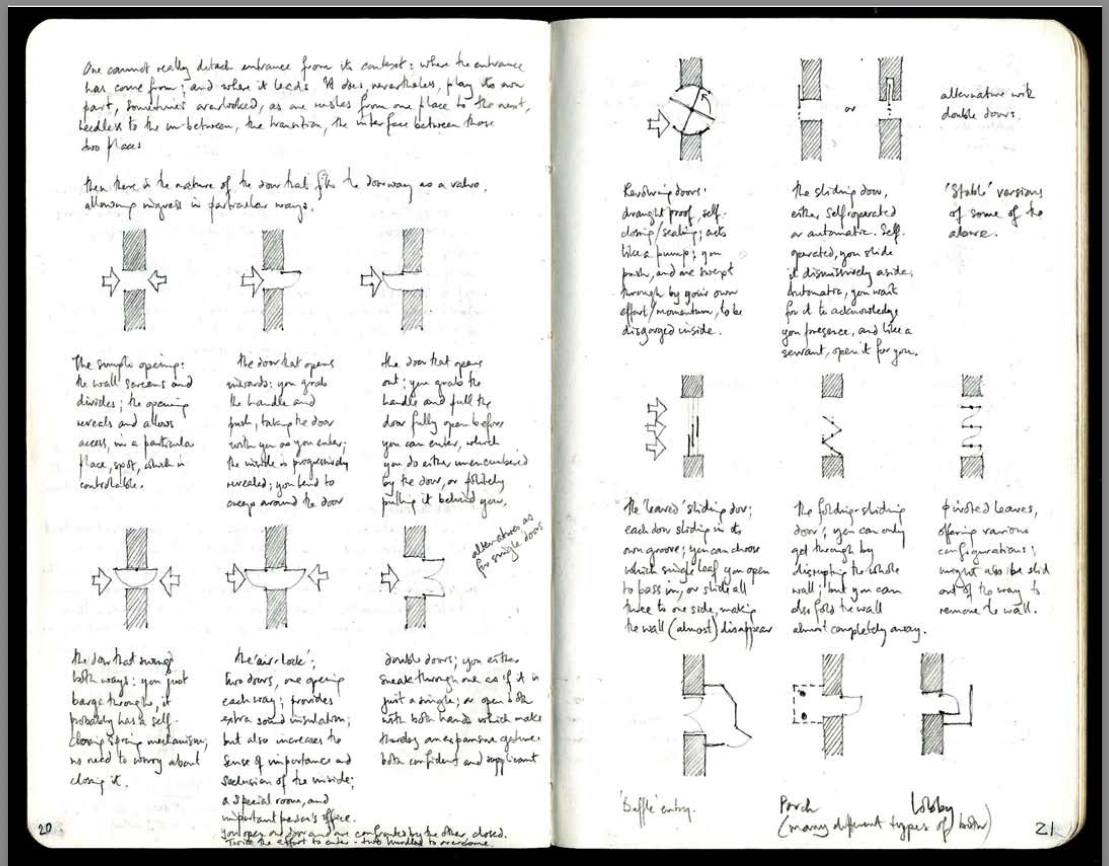
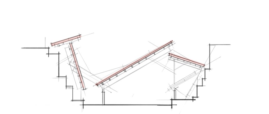
The screen shots in this post are extracts from the notebook named ‘Entrance’
There is that old saying, often attributed to Chinese wisdom: “The faintest ink is better than the strongest memory.”
That line stays with me.
The idea behind the notebook assignment is to build a habit along those lines: to write, to observe, to collect, and to return.
link)

You must be logged in to post a comment.