
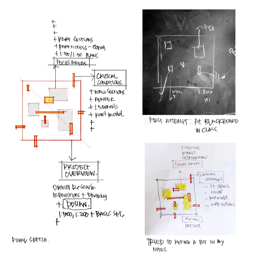
This thesis cycle, I set up a threshold discussion with students before their final submissions. We needed to talk about what was actually important to draw, design, and represent – because thesis work can get really overwhelming when you’re trying to figure out what needs to be documented. So I created a diagram to help them see the bigger picture. It maps out four levels of work and shows how they connect:
Project Overview – Your enquiry, key questions, and overall concept
Design Deliverables – The basic set of drawings that communicate your project
Focus Areas – Where you go deeper with detailed plans, sections, and strategies
Critical Conditions – The moments that need the most resolution: wall sections, key renders, models, post-analytical diagrams
The diagram helps students clarify and reveal the connections between these layers. It shows them that not everything needs the same level of detail, and that their enquiry should guide where they invest their time and effort. Having this visual framework made a real difference. It wasn’t just a reference tool – it became a way for us to have meaningful conversations about strategic choices. Students could see where they were in the process and make informed decisions about what their thesis really needed to communicate.
Drawn and Traced in Morpholio Trace / Text Edited with LLM

You must be logged in to post a comment.